Lab Skill Activity - Analyzing Data in Mathematica
Contents
1 Goals
You will be…
…able to define and use functions in Mathematica.
…able to scale and shift lists (arrays) of data.
…able to generate and combine plots of data and functions.
…able to perform least-squares fits of data.
…able to create pretty looking plots.
2 A Few More Mathematica Basics
Defining functions that perform a sequence of mathematical or logical steps is a key part of every programming language. Watch the screencast on defining and using functions in Mathematica.
- Define a function in Mathematica that represents \(f(x) = sin(x)/x\)
- Explain the difference between how Mathematica interprets
the following two expressions:
y = x^3y[x] := x^3
A “List” in Mathematica is the equivalent of an “array” in most other programming languages (like C, Python, MATLAB). This exercise requires you to create a list and perform the basic list manipulations like shifting and scaling all list values by a constant. You may need to consult the Mathematica help documentation.
- Create a list named
sinTableusing theTablefunction to evaluate the expressionSin[x]at 100 points between \(0\) and \(4\pi\). - Increase all values of the list
sinTableby a constant (e.g., 1). - Multiply all the values of the list
sinTableby a constant value (e.g., 10).
3 Creating Plots of Data and Function Together
In Mathematica Plot is used for plotting functions and ListPlot is used for plotting data. If we want to combine a plot of a theoretical prediction or a best fit curve with our data we need to combine these two different kinds of plots. The key method is Mathematica’s Show function.
Watch the screencast on combining plots of data and functions.
- Write down a mathematical expression for the predicted
output signal of a waveform generator for either the square
wave, saw tooth wave, or triangle wave. You can write a formal
math expression or use the builtin Mathematica functions for
Sin,SquareWave,SawtoothWave, andTriangleWave(consult Mathematica’s help for using these appropriately). - Make a plot of your prediction using the expression you created above.
- Scale your
sinTablefunction from Sections 2.3-5 to the same frequency, amplitude, and offset as the expression you created in 3.1. Combine the plot of your oscilloscope data with your prediction. Do they match up exactly? If not, did you make a mistake, or is there a good reason for the difference?
4 Fitting Data
Scientists often need to perform fits to their data. This
could be because they know the functional form the data should
follow and use a fit to determine one or more parameters in the
function. Or because they don’t know the functional form and
try various functions to see which one best fits the data.
After completing this activity, you will be able to use the
LinearModelFit and NonlinearModelFit
functions for doing least squares fitting of data. You will
demonstrate your proficiency by fitting an exponential decay.
The data are the number of counts detected as a function of
time for cosmic ray muon decays. The data were taken in a
previous semester as part of the muon lifetime lab. The decay
time you estimate from the least-squares fit is the lifetime of
the muon. The muon data is available here.
Watch the screencast on fitting data in Mathematica.
- Write down a mathematical expression for the function you will use to fit your data.
- How many free parameters do you need? Give a brief explanation in words, or with a graph to explain what they mean.
- How do you relate your fit parameters to the muon lifetime \(\tau_{muon}\)?
- Is the fit function linear or nonlinear?
- Fit the data and obtain \(\tau_{muon}\).
- Make a combined plot of the data and fit.
5 Making Classy Plots in Mathematica
The default plot style in Mathematica does not look very
good for presentation quality graphics. This screencast give
some options for changing the plot style. Figure 1 shows an example of the plot style
changes you will be able to implement after watching the
screencast. The screencast also demonstrates the use of the
SetOptions function which allows you to set the
default plot options.
Watch the screencast on changing the plot style.
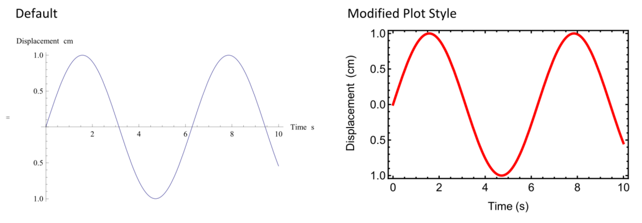
Default
Plot[Sin[x], {x, 0, 10},
    AxesLabel -> {"Time (s)", "Displacement (cm)"}]
Modified
Plot[Sin[x], {x, 0, 10},
    Frame -> True,
    Axes -> False,
    LabelStyle -> {FontFamily -> "Arial", FontSize -> 13},
    FrameLabel -> {"Time (s)", "Displacement (cm)"},
    FrameStyle -> Thickness[0.005],
PlotStyle -> {Red, Thickness[0.01]}]- Modify any one of the plots produced earlier in this activity and make it “classier”.